Understanding Food Labels
Do you ever look at food labels? Or do you just pick up what you want or what you need without ever fully reading or taking in what you are about to eat?
Do you understand the traffic light system for particular foods that you see on the front of their packaging?
Your weekly shopping trip shouldn’t need to be an over the top obsessive experience but it is important to understand the foods we eat and if like a lof of people you are a creature of habit then it’s certainly a worthwhile exercise to do once. What you will find might very well shock you!
The reason the prodcucers of these products brought them in is because they were forced to, not out of the goodness of their hearts. It is a government health initative to show people the quantity of certain things in the product that may have negative affects on their health. For some big companies it forced their hand to make healthier options because they couldn’t hide it anymore. For others it didn’t matter and they kept producing it the same way but then found some sneaky loopholes, not so much to cover up why people shouldn’t be eating it but more to present it in such away that’s more appealing to an ever growing health conscious society.
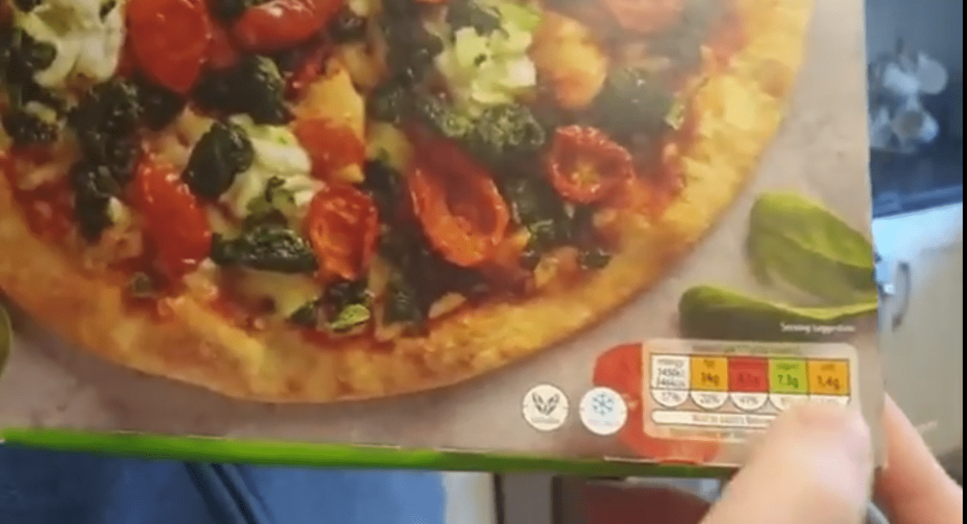
In a video recently posted on our facebook page we used a store bought vegetarian pizza from a local store here in Ennis as an example for explaining how to read food labels and what to watch out for:
Read the fine print first:
Something a lot of people don’t watch out for and it’s what the marketing department of these food companies hope you don’t see is the fine print. What fine print you might ask…
Let’s start at the front. Using the pizza box as an example, the traffic light system for the nutritional info is on the bottom right corner (and is for most products in general). Take a close look at the text above the “traffic lights” and it says that the values you are looking at in their respective colours are based on a half pizza and this is hugely important. At a glance people can interpret these values to mean what’s in the whole pizza when that’s not the case and then you are caught off guard and actually eating double what you thought you were. Some pizzas even list it as a quarter pizza because otherwise the values would be sky high and probably wouldn’t sell as much. That fine print isn’t easy see on some things and they know it
Next up is how they represent the sugar content in the foods. This isn’t so much a “fine print” thing as a sneaky thing. The big companies will you use the excuse that they were told to represent the sugar content as a percentage of your total recommended allowance of sugar intake and not the recommended ADDED sugar allowance – BIG difference.
You see some products contain small amounts of naturally occurring sugar in them. Take chocolate easter eggs, a small amount of that sugar comes from the sugars in milk but a hell of a lot more comes from sugar that’s added in. Right now there are no regulations putting pressure on companies to indicate the percentage of added sugar in their foods but I believe their will be soon.
What does all that mean. Well, quite simply, your recommended daily intake of total sugar is 90g but your recommended intake of added sugar is just 20g. Now if something you are about to eat contains 14g of sugar that’s just 16.7% of your total sugar allowance but is 75% of your added sugar allowance. Can you imagine if they put 75% on the fron of that packet in a big red section, I guarantee their sales would plummet.
So if you see something like that and you have a suspicion that there is more than the amount listed, take a look at the ingredients on the back. By law they have to list the position of the ingredients from top to bottom based on how much is in there and if you see sugar listed in the first 5 places, there is a lot of added sugar in there and you can take it that number at thr front should be a lot higher than your being told.
The Traffic Light System
On the front of the nutritional information traffic lights it normally lists calories, fat, saturated fat, sugar and salt.
If you think of ordinary traffic lights, the same concept applies here. Red is stop or at least use extreme caution, whatever you are about to eat is super high in that particular item. Orang or amber implies it’s ok to go ahead with but starting to get high content of that food and to eatch your total intake for the day as it could quite possibly puch you over the edge. Green then is good to go. You are in a low quantity territory for that food.
Comparing the same food types
When you flip the packet of any food stuff over you will see more nutritional info. This breaks down more of the nutrtional values fully into carbohydrates, how much of that is sugar and so on but importantly is shows you not only what is contained in a serving but also what is in 100g of that food.
The reason that’s important is it allows you to compare similar foods like for like. So for example if you had a pizza that was 400g in one hand and another pizza that was 540g in another then obviously the nutritional values in terms of total calories and fat etc would be higher but you can compare like for like by having a quick look at the per 100g listing on the back and like for like which one has more sugar, more saturated fat per servings. Obviously if you eat more of anything you are consuming more but you can tell the difference in quality by using this information table at the back.
Food labels are there to help you make smarter choices but we also need to be aware of they can be manipulated to some degree to sell you more of a food that you may not need
Follow us on facebook: www.facebook.com/ozonegym
Follow us on Instagram: www.instagram.com/ozonegymennis/
Don’t forget to subscribe to our youtube channel for the latest videos:


